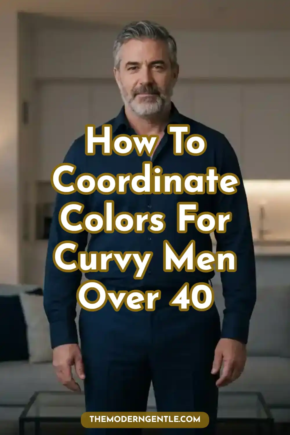
How to Coordinate Colors for Curvy Men Over 40 (Easy Rules)

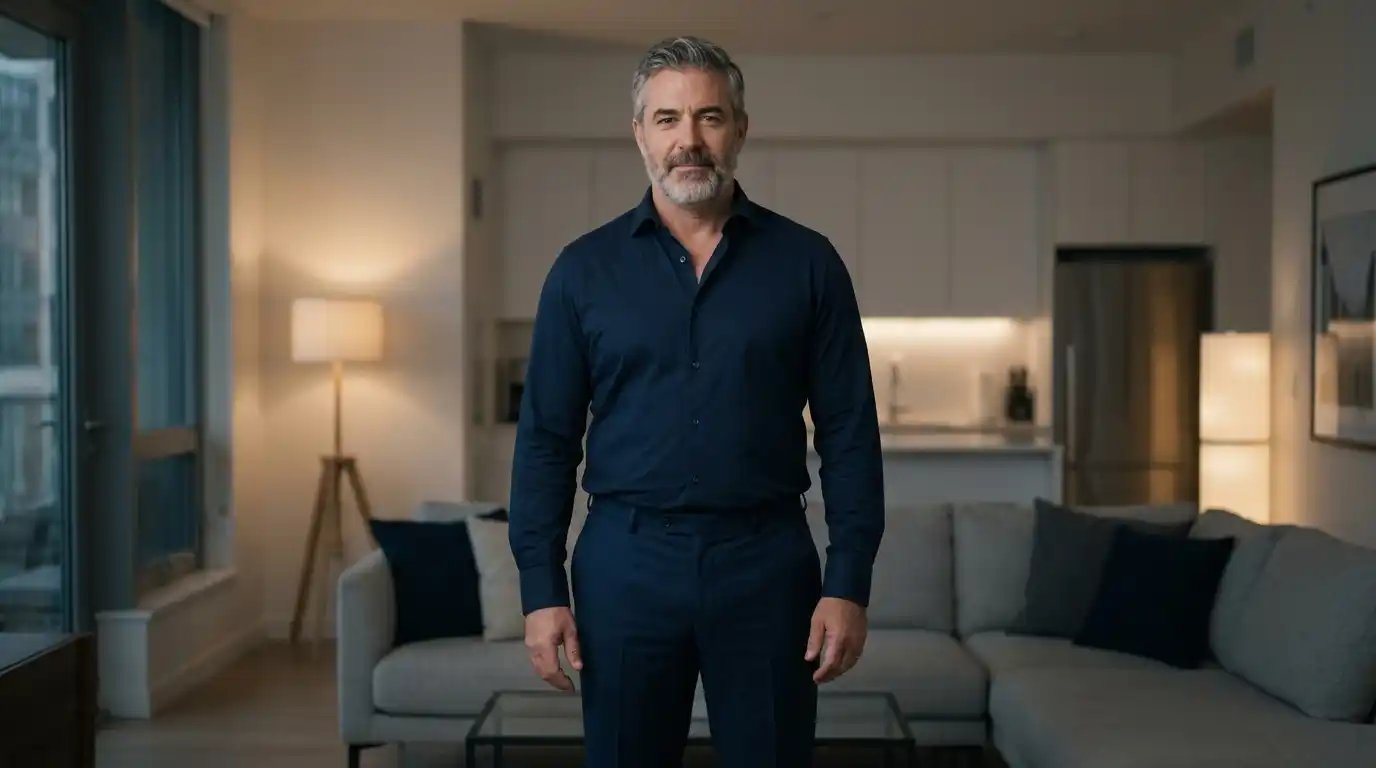
If you are a man over 40 carrying extra weight, you have likely been handed the oldest, most uninspired style rule in the book: “Just wear black.”
By the time you reach your 40s and 50s, hiding under shapeless, dark clothing does not make you look smaller.
It just makes you look invisible or uninspired. Curvy, stocky, or plus-size frames deserve color.
But misplacing bright hues can visually expand your midsection or chop your height in half.
This guide breaks down exactly how to coordinate colors for curvy men over 40 using simple, data-backed rules.
You will learn how to deploy modern neutrals. You will see how to use accent colors to draw the eyes upward.
Finally, you will find out how to execute structural layering without adding physical bulk to your frame.
By upgrading your approach to color palettes for larger men, you can build plus size mens clothing combinations that project absolute confidence.
The 60-30-10 Rule for Plus Size Mens Clothing Combinations
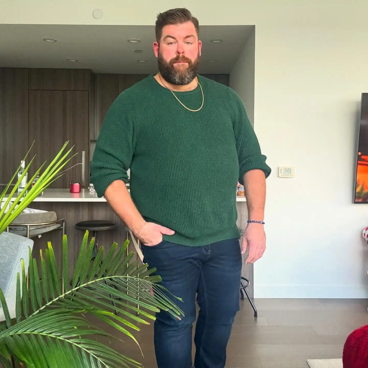
Think of your outfit like a well-designed room. It needs a foundation, a supporting player, and a single point of interest.
To get this balance right, you can use the classic 60-30-10 design ratio.
fThis mathematical approach keeps your visual weight perfectly balanced. It prevents a single bright color from overwhelming your frame or making your midsection look wider.
Here is how the ratio breaks down for your daily wardrobe:
- 60% Dominant Base Color: This is your anchoring layer. It should consist of your outerwear, jackets, or suits.
- 30% Secondary Color: This covers your pants or your main shirt layer. It supports the base color without competing for attention.
- 10% Accent Pop: This is reserved for small items like ties, pocket squares, footwear, or the inner collar of a knit shirt.
Data from style authorities like Real Men Real Style shows that limiting an outfit to three total colors prevents visual confusion.
For a larger build, you want to anchor your 60% baseline with matte, substantial fabrics. Avoid the thin or shiny materials that cling to your body.
Modern wardrobes for 2026 have moved away from cold, muddy grays. Instead, use deep navy or dark charcoal as your foundation.
For example, do not wear a bright orange hoodie that acts as a giant spotlight on your stomach. Instead, choose a dark charcoal jacket for your 60% base.
Pair it with dark indigo jeans for your 30% layer. Then, let a burnt orange knit polo peek out from the collar for your 10% accent.
The Midsection Rule: Never let your bright 10% accent color cross your waistline. A bright belt or a loud graphic print cuts you in half horizontally and makes you look shorter.
Monochromatic Styling for Big Guys to Elongate the Frame
If your goal is to look taller and cleanly put-together, monochromatic styling is your ultimate cheat code.
The science behind this approach relies on the unbroken vertical line.
When your torso and your legs share a similar color depth, the human eye tracks smoothly up and down. This trick adds perceived height and slims your overall silhouette.
Pro Tip: Monochrome doesn’t mean matching one flat shade. Mix 2–3 tones of the same color family (light, medium, dark) plus varied textures — knit, twill, cotton — to keep the look rich instead of flat.
However, do not mistake monochrome for a boring, all-black uniform. In 2026, styling for larger men means layering varying shades, tones, and tints within a single color family.
You can move past basic black into rich, saturated options. Excellent choices include chocolate brown, deep olive, or slate blue.
You can create a great weekend look with this tonal formula:
- Pants: Deep chocolate brown, relaxed-fit chinos.
- Top Layer: A medium-brown, unstructured cotton overshirt.
- Base Tee: A soft cream pima-cotton crew neck.
This combination creates a high-end look. It avoids a harsh horizontal break at your waist.
To keep a single-color outfit from looking flat or blocky, you must mix your textures. Pair a matte knit polo with crisp, twill chinos.
The difference in the fabrics creates depth, even when the colors are very close.
The Ultimate Guide to Color Coordination for Bigger Men
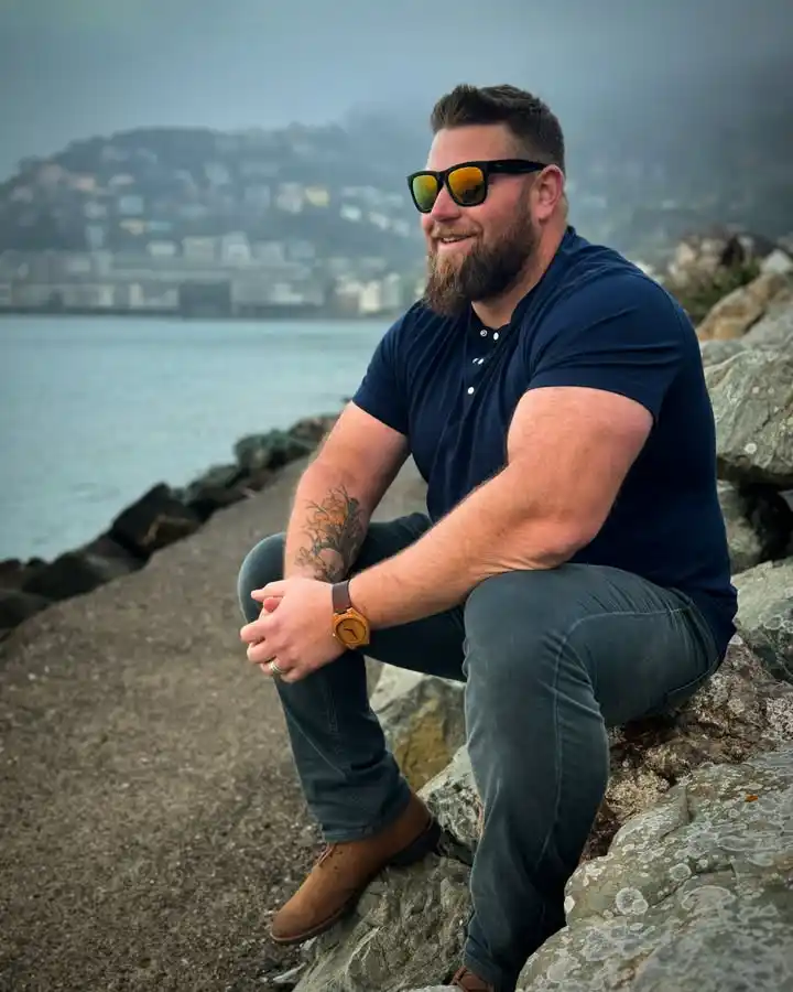
Color coordination does not stop at your shoulders. Its primary job is actually to frame your face and draw attention upward.
This is why your contrast rules change after you cross into your 40s. Hair graying, beard changes, or thinning hair alter your natural contrast level.
You need to match the depth of your clothes to the natural contrast of your face.
Gray/white hair + pale skin, or dark hair + dark skin → stick to soft neutrals like stone gray and sage green.
Dark hair + fair skin, or white hair + dark skin → go bold with navy blazers and crisp white shirts.
If you have low contrast, which means gray or white hair with pale skin, or dark hair with dark skin, stick to soft neutrals and earthy tones.
Gentle shifts, like stone gray paired with sage green, work best. These tones prevent bright garments from washing out your facial features.
If you have high contrast, such as dark hair with fair skin, or vivid white hair with dark skin, you can handle bold combinations. A deep navy blazer over a crisp white shirt works beautifully for you.
No matter your contrast level, place your lightest or brightest colors near your neck and chest. Think of an open jacket as two vertical frame brackets around your torso.
Keeping the light tones inside the dark brackets creates a narrowing effect for your midsection while keeping eyes focused on your face.
3 Effortless Color Combinations for Every Occasion
Building an updated wardrobe does not require guesswork. Use this simple pairing matrix to coordinate your outfits based on your daily lifestyle.
Modern Executive
60%: Charcoal Gray Jacket
30%: Black Trousers
10%: Burgundy Shirt
Smart Casual
60%: Navy Blazer
30%: Camel Chinos
10%: White Pocket Square
Relaxed Weekend
60%: Olive Overshirt
30%: Indigo Jeans
10%: Cream Tee
These formulas work because they balance rich warmth with structured depth. Resources like 40 Over Fashion emphasize that these classic tones project maturity without looking outdated.
You can screenshot this table to use as a quick reference guide when you go shopping.
Summary of Easy Color Rules
Stepping away from all-black outfits does not mean you have to look loud.
By applying the 60-30-10 rule, leaning into tonal monochromatic layers, and placing your color accents near your face, you can master color coordination with absolute ease.
Quick Recap
- Use the 60-30-10 ratio to balance base, secondary, and accent colors
- Layer tonal shades within one color family for a monochromatic, elongating look
- Match clothing depth to your face’s natural contrast level
- Keep bright accents above the waistline — never let them cross it
Open your closet today. Select your favorite dark neutral jacket. Try pairing it with a rich, earth-tone layer instead of your standard black t-shirt. You will instantly notice a sharper, more sophisticated reflection in the mirror.