15 Color Based Capsule Wardrobe Ideas for Men (Simple Palettes)

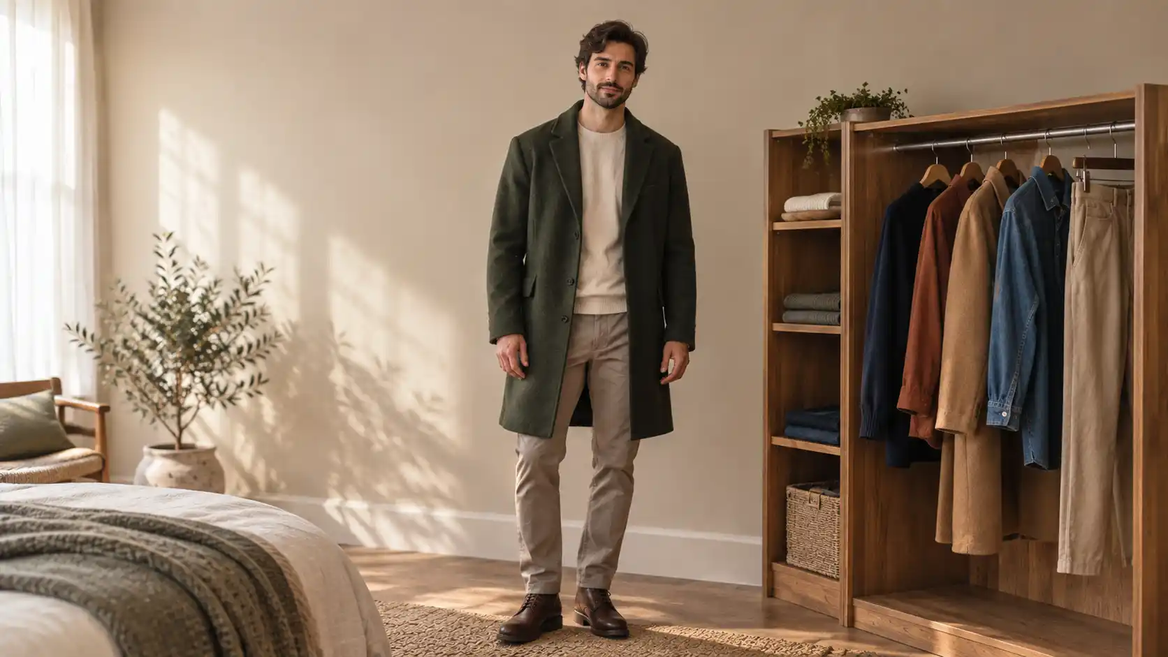
A full closet and nothing to wear is usually a color problem, not a quantity problem. Most men buy one piece at a time.
One gray jacket in March, a burgundy sweater in October, olive pants because they were half off. Each looks fine alone, and together they argue.
Picking one small palette and staying inside it fixes that. Choose a base, add two or three shades that sit near it, and nearly everything in the drawer matches without thought.
Fewer pieces, more outfits, no standing at the mirror at seven in the morning.
The color based capsule wardrobe ideas for men below each run on a tight palette. Every one lists the pieces, how to wear them, and what to swap when the weather or the invitation changes.
Some play it safe, like navy and charcoal. Two take a small risk, like a dark base under one bright layer.
Start with whichever palette sits closest to what you already own. You probably need three new things, not thirty.
1. Indigo and White: The Denim Capsule That Works in Any Season
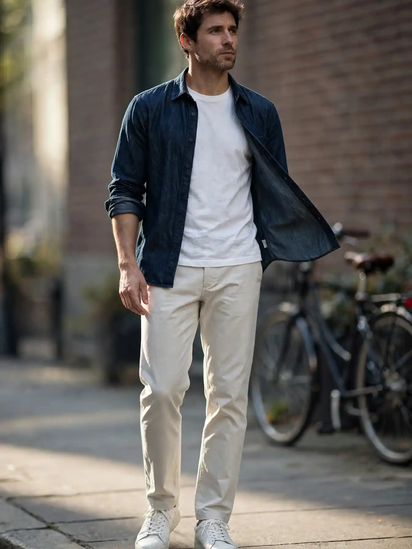
The build: indigo denim shirt or jacket, white tee, off white chinos, white leather sneakers.
Wash decides everything here. Dark raw indigo looks sharp enough for dinner, while a faded pale wash reads weekend only. Owning one of each covers more ground than three mid tone pairs ever will.
Never stack denim on denim unless the two washes sit far apart. A dark jacket over pale jeans works fine. Two mid blues together look like an accident.
Care tip: wash indigo inside out in cold water and hang it dry. Heat pulls the color out fast and takes the crispness with it.
2. Gray With a Burgundy Accent: A Quieter Way to Wear Color
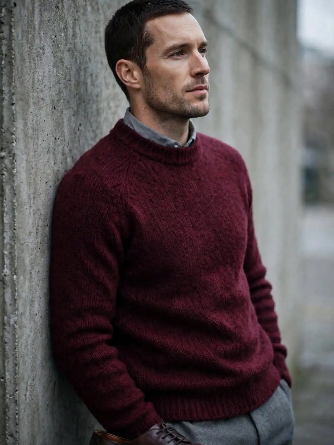
Burgundy does what black cannot. It brings warmth without brightness, so a wine colored sweater over gray trousers still reads calm in a room full of navy. One piece is plenty. Two starts to look like a theme.
Color note: deep wine and bright red are not the same thing. Hold the sweater next to a gray shirt and keep the one that looks brown before it looks red.
Shoe upgrade: dark brown leather bridges gray and burgundy better than black ever does.
Seasonal swap: in warm months move the color into a short sleeve knit and keep everything else pale gray.
3. Rust and Cream: An Autumn Palette That Beats Plain Brown
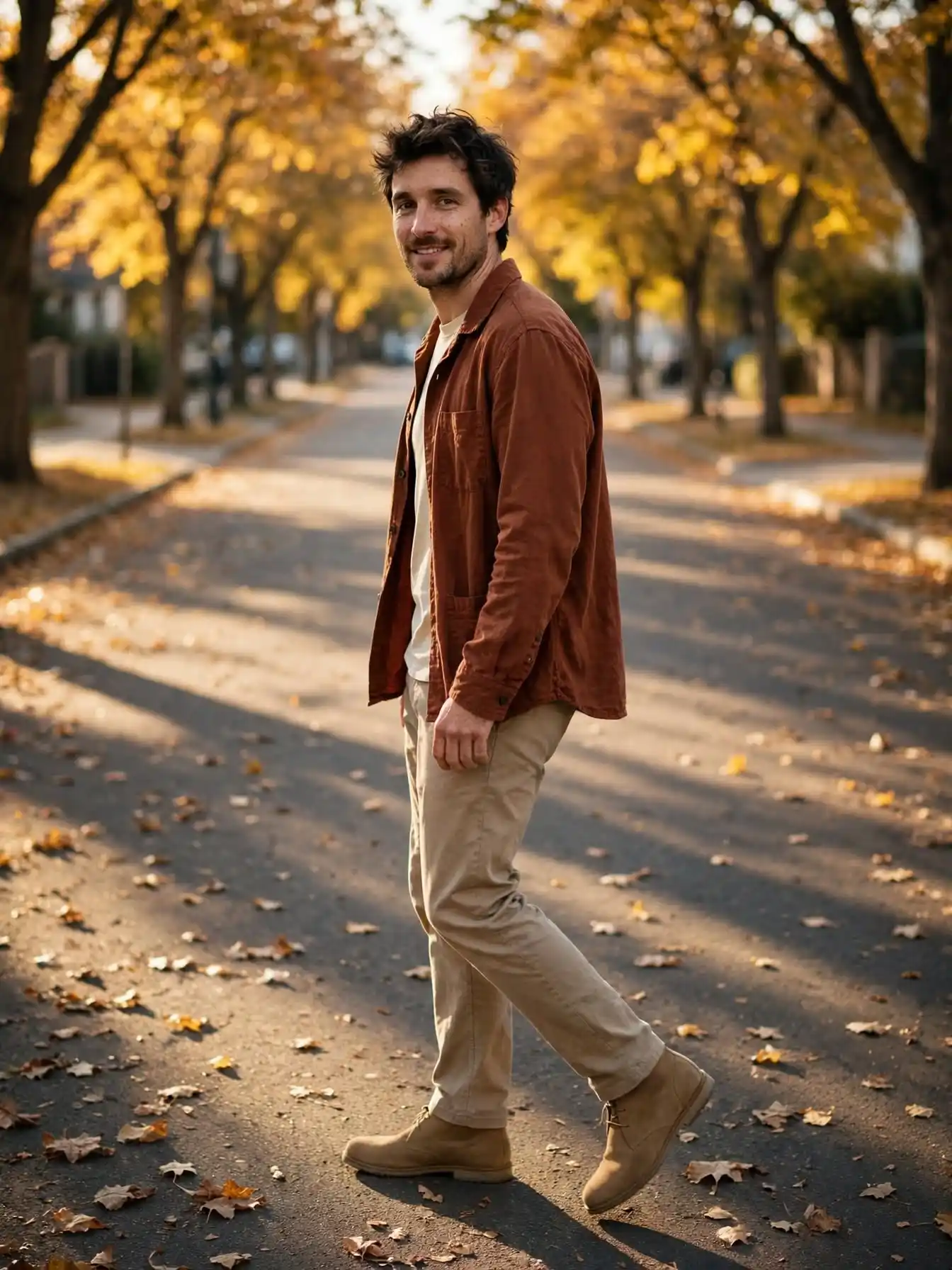
Rust sits between orange and brown, which makes it easier to wear than either one on its own.
Set against cream, the whole outfit warms up without getting loud. A rust overshirt, cream tee, and stone chinos is the entire kit.
Why this palette holds up:
- Rust reads as a decision, while plain brown reads as a default.
- Cream near the face stops the warm tones from going heavy.
- Oat or stone trousers keep the bottom half quiet.
Try instead: if rust feels strong, a brick or clay tone gives the same warmth at half the volume.
4. Pale Blue and Khaki: The Hot Weather Capsule That Stays Crisp
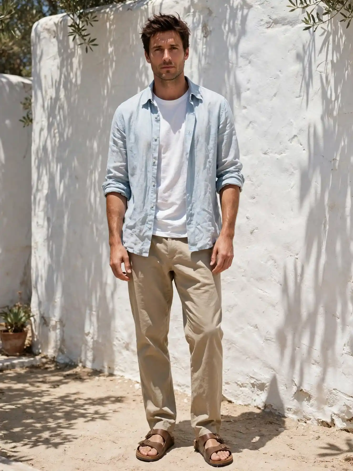
Heat ruins most palettes. Dark colors pull in sun and show sweat, so summer calls for light shades and loose weaves.
Pale blue handles the job white usually gets, minus the transparency problem. Put it in a linen shirt, leave it open over a plain white tee, and pair it with khaki chinos or shorts.
Cut matters more than the fabric label. Air needs room to move, and a shirt sitting tight across the chest will feel hot no matter what it is made from.
5. Beige on Beige: One Color, Three Shades, No Thinking Required
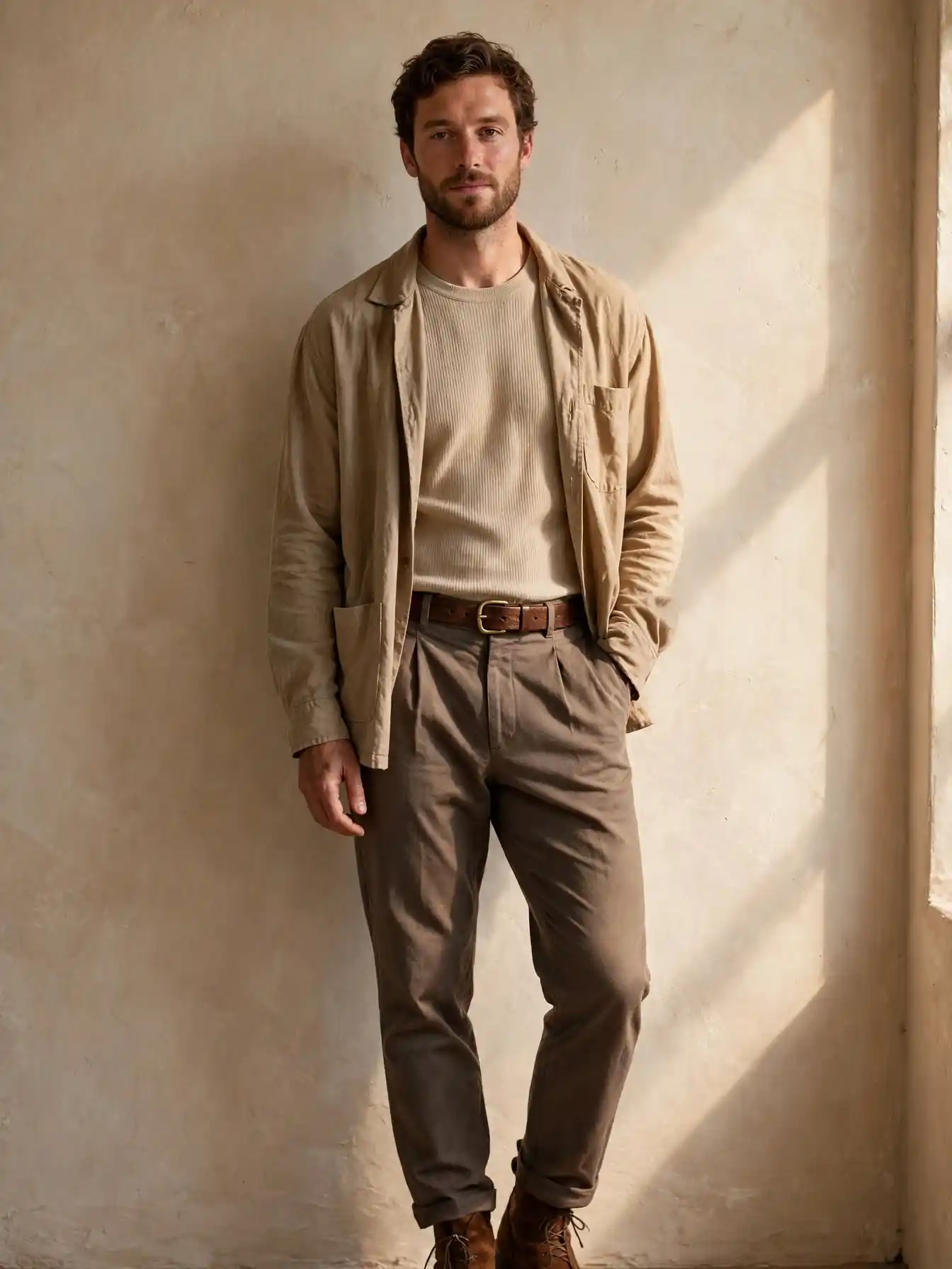
- Layer one: oat colored crew neck tee
- Layer two: sand overshirt or soft jacket
- Trousers: darker taupe chinos
- Leather: mid brown belt and boots
Tonal dressing falls apart when the shades sit too close together. Choose pieces that clearly differ in depth, lighter at the top and deeper toward the shoes, and the eye reads one long clean line instead of a beige blur.
Texture note: three smooth cotton pieces in similar beige look flat in photos. Bring in a ribbed knit or brushed cotton so the layers separate.
6. Forest Green and Cream: A Cold Weather Palette That Is Not Black
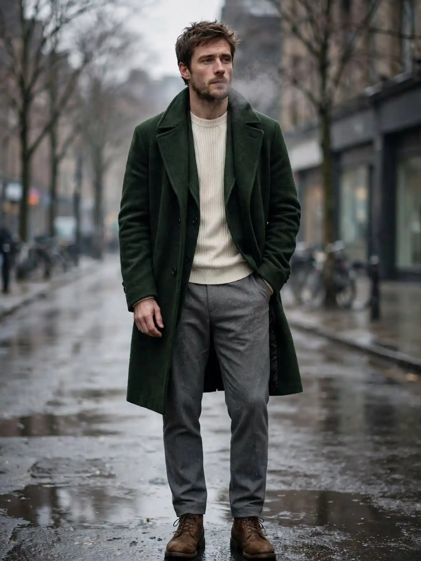
Made for: winter days when everyone else defaults to a black coat.
Deep green sits close enough to neutral that it pairs with gray, cream, tan, and denim without any argument.
A heavy green knit or wool overcoat carries the whole palette, and cream underneath keeps things from going dark at the neck.
Cream trousers push it dressy, gray flannel keeps it easy. Brown boots rather than black hold the warm side of the palette together.
Comfort upgrade: wool blends beat pure acrylic in this color. Acrylic green catches a shine under indoor lighting and cheapens everything around it.
7. Cream and White: The Palette That Reads Expensive on a Small Budget
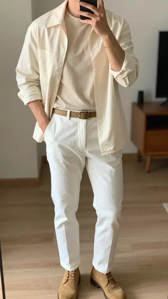
- Top: cream tee with a raw hem
- Bottom: white or off white slim chinos
- Shoes: tan desert boots
- Finishing touch: thin leather belt and one gold bracelet
Light neutrals live or die on fabric weight. Cotton with a bit of structure holds its shape, while thin jersey clings and shows every crease by lunchtime.
Tuck only the front of the tee so the belt stays visible and the waist keeps a clean line.
The detail to steal: two shades beat one. Cream on top and true white below creates depth, and the eye reads that as a decision rather than an accident.
8. Sage Green and Beige: A Soft Color Capsule for Ordinary Weekdays
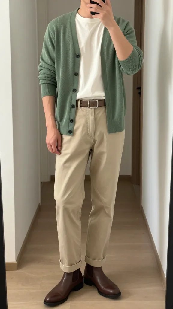
Sage behaves like a neutral even though it is a color. It sits quietly next to beige, cream, and brown, so a single sage knit will match most of what already hangs in your closet.
Build it around a sage cardigan or pullover, beige chinos, and a plain cream tee underneath. Brown boots warm the whole thing. Keep the belt in taupe instead of black so nothing jumps out of the palette.
Sleeves rolled once make a knit look worn in rather than fresh off the hanger. That small bit of mess is the difference between an outfit and a mannequin.
9. Navy and Charcoal: The Capsule You Can Wear Five Days Running
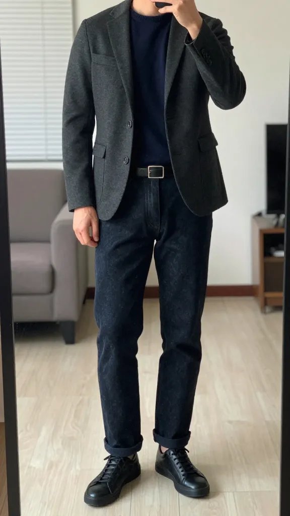
Best for: work weeks where nobody should notice you repeating clothes.
Navy hides wear, survives washing without fading fast, and sits under almost any jacket.
Pair a crew neck navy sweater with dark straight jeans on Monday, then move that same sweater over charcoal chinos on Wednesday. Nobody tracks the difference.
Keep everything in the cool half of the color wheel. Warm brown next to navy turns muddy under office lighting, so black or dark gray leather works better for the belt and the shoes.
Shoe swap: black leather sneakers keep it casual, while plain dark boots carry the same two pieces into dinner with no change of clothes.
10. Chocolate Brown and Tan: Warm Depth for the Cold Months
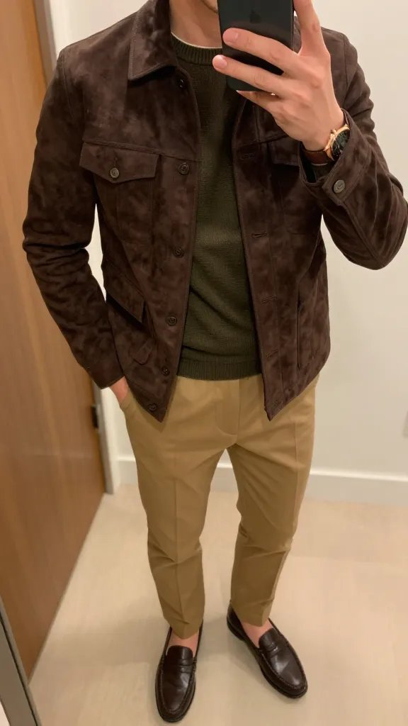
Outfit formula: brown suede jacket plus a black or cream tee plus tan chinos plus brown loafers.
Brown on brown needs contrast in texture, not in color. Suede against smooth cotton looks rich, while two matte brown pieces stacked together fall flat and read sleepy.
A cream layer at the neck lifts your face and stops the whole thing from becoming one long column. Copper or bronze metal in a watch sits better here than bright silver.
Fabric note: rain marks suede fast, so keep a cheap protector spray by the door and give anything new two coats before the first wear.
11. Slate Gray Layers: The Capsule That Packs Into One Carry On
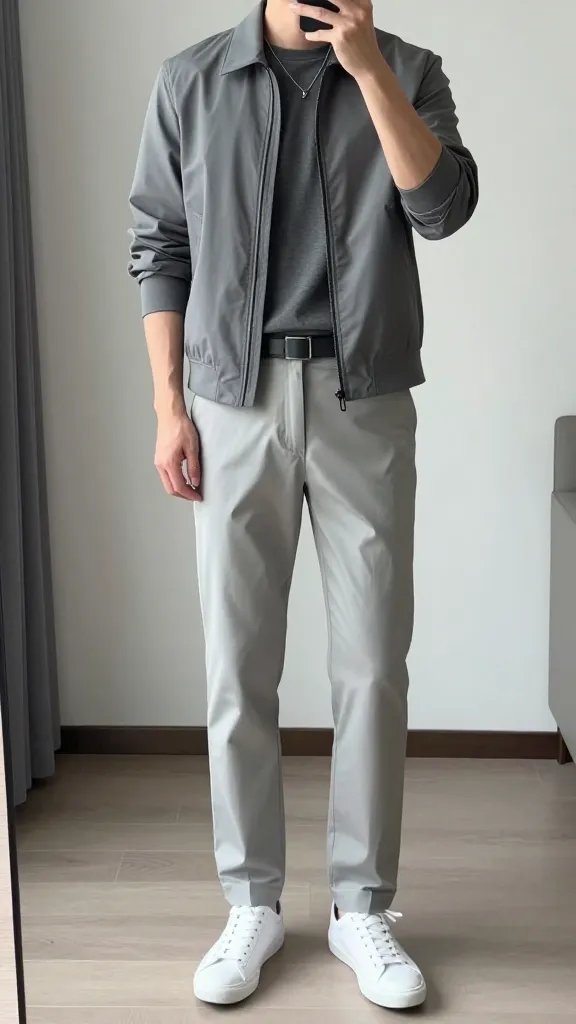
Gray earns its spot in a suitcase. Wrinkles hide in the weave, spills show less than they would on cream, and one shade of gray always agrees with the next.
Why it works:
- Three gray tones stacked read as a considered outfit, not a uniform.
- White canvas sneakers stop the whole look from turning gloomy.
- Silver hardware matches gray more cleanly than gold or brass.
Packing tip: a light gray jacket, two gray tees, and charcoal chinos cover four days. Add one white shirt for the night you get invited somewhere better than planned.
12. Olive and Sand: A Military Palette Without the Costume
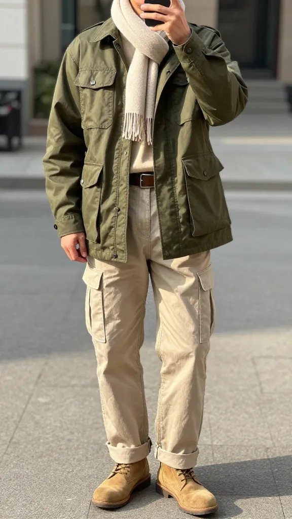
Olive carries plenty of weight on its own, so the rest should stay quiet. Sand chinos, a cream tee, and a utility jacket in olive give you three pieces that rotate into almost everything else you own.
Color note: olive leans green in daylight and gray under indoor bulbs. Check the jacket near a window before you commit.
Budget swap: a plain cotton overshirt in olive costs a fraction of a real field jacket and layers under a coat far more easily.
Skip this: matching cargo pants to the olive jacket. Two military pieces at once stop looking like clothes.
13. Charcoal Base With One Bold Accent: Color Without the Risk
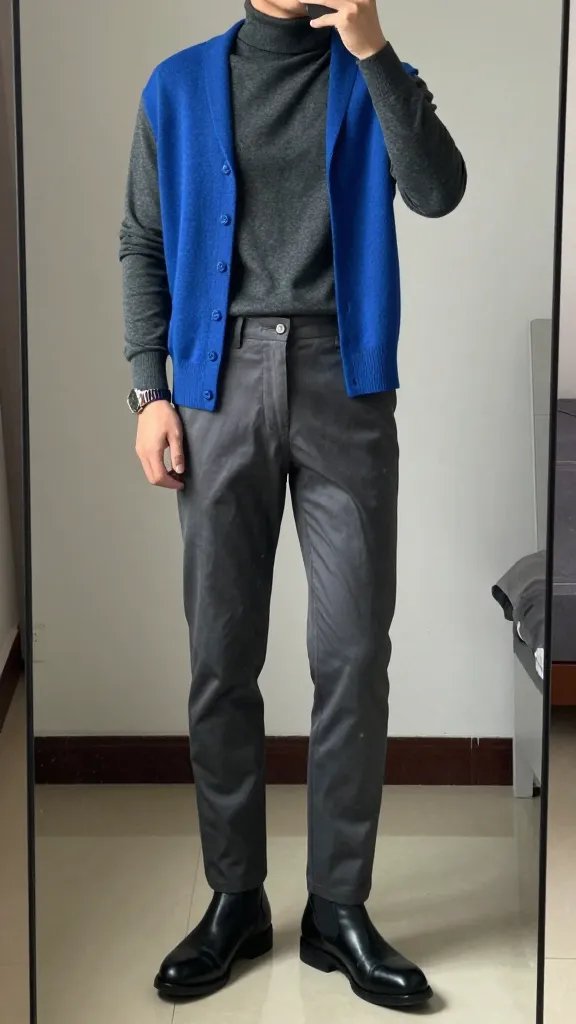
- Base layer: charcoal roll neck or crew neck
- The accent: one saturated piece in cobalt, deep green, or burnt orange
- Bottom half: mid gray jeans or charcoal chinos
- Feet: black leather boots
Dark neutrals let a single color do all the talking. Keep every other surface matte so the accent stays the only thing with saturation. Fit should look clean rather than tight, which matters most over a knit.
One small change: if a full cobalt sweater feels loud, put the color on a scarf or socks first and see how often you actually reach for it.
14. Cream and Camel: Light Colors That Still Look Grown Up
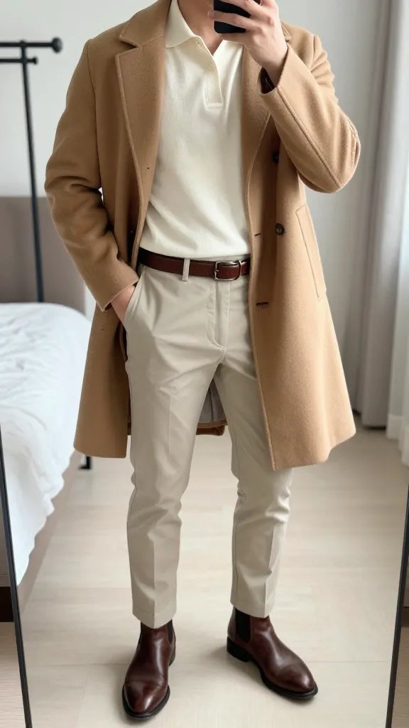
Light colors get called risky, mostly because people buy them in thin fabric. Camel wool and a ribbed cream knit hold their shape, so the outfit looks built instead of draped over you.
Stack the tones so each one sits slightly deeper as you go down. Cream knit polo, beige tapered trousers, taupe boots. A natural leather belt ties the middle without cutting the line in half.
Anchoring matters here. Without one darker element at the feet or the waist, pale outfits float and lose their edges, which shows up fast in photos.
15. Black With a Sand Accent: An Evening Capsule That Softens the Edge
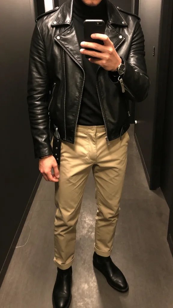
Wear it for: nights out where head to toe black would feel like a uniform.
Black jacket, black tee, sand chinos. That one warm color at the leg breaks the block and keeps you from reading as staff at the venue.
Shape handles the rest. Clean boots and a jacket ending at the hip keep the silhouette tight, and dark metal in a ring or watch face beats bright silver against black.
Accessory idea: one piece only. Two rings, a chain, and a watch turn a quiet outfit busy, and black shows every extra thing you add.

